Determine the client’s optimal and minimal amount of information that the sign can have in order to attract their customers. Once this is determined you can move forward with flexibility on size, illumination, etc.
The answer to this question allows us to assess the speed of travel for the eyes on the sign. For example pedestrian, bicycle, urban, highway, etc. Each has very unique characteristics. A pedestrian oriented sign and a motorist oriented sign have very different design criteria. The faster the traffic the smaller amount of time to view, so the simpler the better with larger letters, and logos.
Review the line of site from each direction from the sign location with attention to the viewing distance. Can a driver see the sign, read its message, process the information, and make the necessary maneuvers in response to the information? This viewer reaction time with distances is key. If 3 feet, include your company history. If 30 feet, just a logo or name is ideal. Always keeping in mind individuals with poor vision.
Reduced legibility = Reduced visibility
Legibility distance = 85% of visibility distance
Legibility distance at night = 88% of daytime legibility
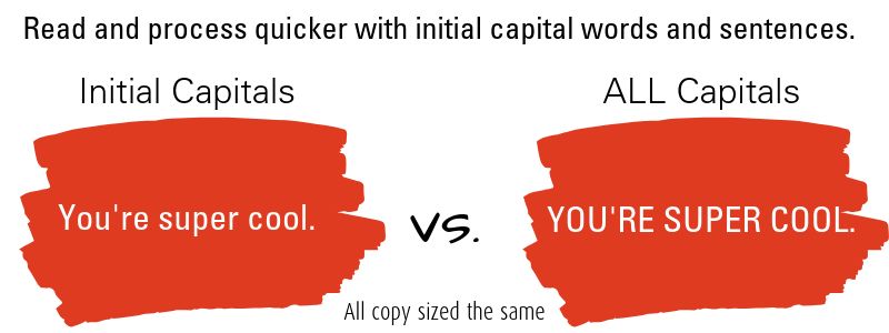
Lower case letters > Legibility distance than capital letters
Capital letters are seen quicker. Lower case are read quicker.
Inter-letter spacing > Letter and word legibility
Stroke width ⅕ of height of letter = excellent legibility

Want to take this further and into actual design? Here’s a great video on considerations for sign designs based on visibility.
Can we send you a free visibility pocket reference? Because we will? Just email us and consider it sent.