
It’s the month of green. St. Patrick’s Day, new grass, sprouting bulbs, and the Chicago River. In a month when color is so important we wanted to share with you how seriously we take it. Being in the sign industry, we all know that color plays a big part, rom branding, to readability, to attention getting. Color is integral to all aspects of our industry.
Back in the day, using a naked eye, we would cross reference colors with Pantone or AkzoNobel color charts then tweak the formula until it seemed to be a match. This could get tricky a lot of paint could be wasted in the process. Luckily, we don’t have to do this anymore. Plus, we don’t have the paint to spare these days #supplychain.
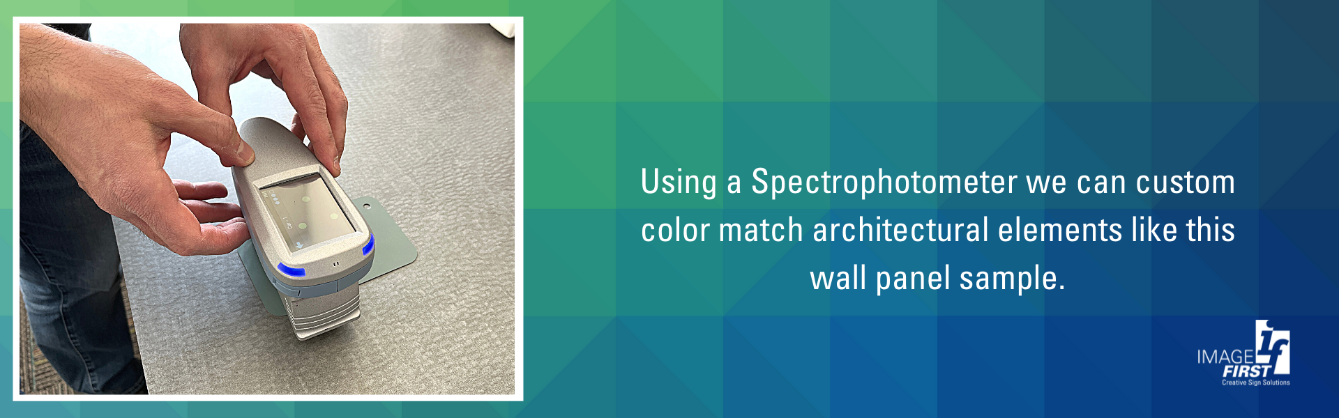
Today, we use a spectrophotometer to get precise color formulas from nearly any sample. When we are working with architectural panels or other elements of a project that the sign color needs to match, this is our go-to. We’re confident in our color matching which makes our clients look good when they go to install custom signage for their clients. See it in action.

ImageFirst™ Signs now manufactures wholesale architectural signage AND energy!
Do we truly understand the difference between Architectural and Commercial signage? The old adage of “form usually follows function” has never been clearer when defining the need and function that a sign will provide.