
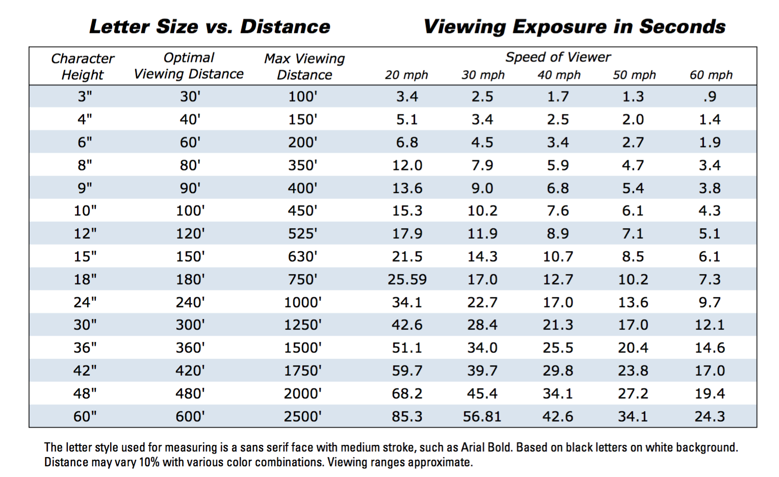
Speed of Travel:Identify the type of traffic who will be viewing the sign (sidewalk traffic, downtown vehicles, or highway traffic, for example). Pedestrian oriented and motorist oriented signs have different criteria of design. Viewer Reaction Time:This represents the amount of time necessary for a driver to see a sign, read its message, process the information, and make the necessary maneuvers in response to the information. Viewer Distance:How far do you plan to display your sign from your viewer? Three feet or thirty feet? Design your sign accordingly, keeping in mind the individual with poor vision, rather than average sight. |
Notes On Visibility and Legibility
|
Do we truly understand the difference between Architectural and Commercial signage? The old adage of “form usually follows function” has never been clearer when defining the need and function that a sign will provide.
Color matching is key especially when it comes to matching architectural elements. How we did it, and how we do it now.